– In the largest urban areas or in areas with the fastest growing population?
[Note 17/1: UHI in limate data originates from changes of UHI over a period. So the general discussion is not if a city has UHI – it has – but if UHI in a town has grown due to expansion of the city or other factors. A more permanent big-city UHI will not disturbe temperature readings. So when we speak of UHI in global temperature trends, then we refer to an average UHI increase around the temperature stations world wide.]
In the article http://wattsupwiththat.com/2010/12/16/uah-and-uhi/ I suggested:
1) Ground based ocean temperature data matches fairly the UAH TLT ocean data – but the ground based land temperature has a warmer trend than UAH TLT land data. I argued that this extra heat in the ground based land data might originate from UHI, adjustments and siting problems.
and
2) The UAH TLT land vs ocean data has a rather similar trend as if they seek an equilibrium in temperatures. I mentioned the problem for ground based data that the land data vs. ocean data has an ever larger difference so far not explained.
Point 1) was intensely debated which as always brings about more knowledge. Especially one argument used based on expectations to where geographically UHI should be seen strong in the satellite years 1979-2010 has been rewarding to examine closer.
Bob Tisdale has made a very useful grid-wise compare of TLT UAH data vs GISS data worldwide which enables further studies on point 1).
http://bobtisdale.blogspot.com/2009/06/part-2-of-comparison-of-gistemp-and-uah.html
This could shed light on the UHI question: If Ground based GISS data warms faster than UAH TLT in areas where we expect UHI, then perhaps a UHI signature is confirmed. And UAH data in compare with GISS data an indicator of UHI.
Example: Central North America/USA.
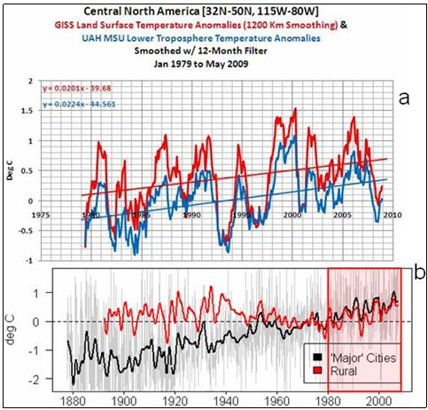
Fig 1a.
Bob finds no significant difference between USA temperatures for UAH vs. GISS ground based for 1979-2009. If one expects that there should be UHI in USA in this period, then according to my suggestion, we should have seen GISS ground based warming faster than UAH USA temperatures.
Fig 1b.
However, for example McIntyres calculation of Petersons USA city-vs-rural data shows no UHI 1979-2009 for USA either… So perhaps we should not expect UHI 1979-2009 for USA?
Based on Tisdales results I have used the following labels on the graphic below:
“NoUHI ” : Means that GISS ground based data often from cities and airports has a rather simlar warming trend compared to the TLT UAH (- sometimes just a little extra warm in GISS data).
“UHI” : Means that GISS ground based temperature trend is significantly warmer than UAH TLT and thus contains something that cannot be detected by satellite, we call it UHI for now.
Heres then how we should expect UHI to be distributed world wide based on Tisdales results:
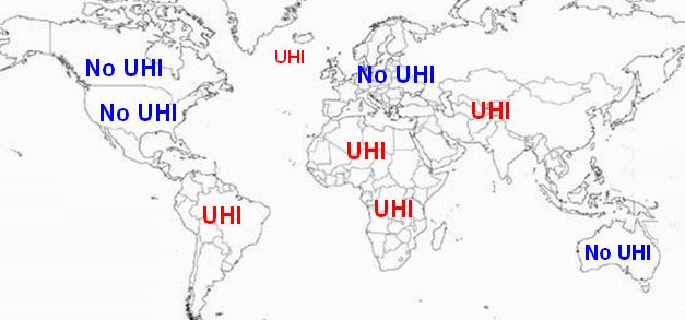
Fig2 So… We should have UHI 1979-2009 in areas with not that dense urbanization? And not in the USA and similar places? Can this be true? Well, I don’t blame anyone for saying that this is not really in favour of the UHI concept. (The North Atlantic “UHI”: See “Post Scriptum B”)
But before throwing data out in the drain and before skipping the UHI idea, do we actually know where geographically we should expect UHI 1979-2009? Lets examine it.
Where should we expect UHI in temperature data 1979-2009?
Lets take a look at the “bible” of UHI Thomas Karls analysis of UHI 1901-1984 done on temperature mostly without temperature corrections done in the period of the global warming debate – and the biggest research of its kind:
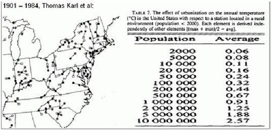
Fig3
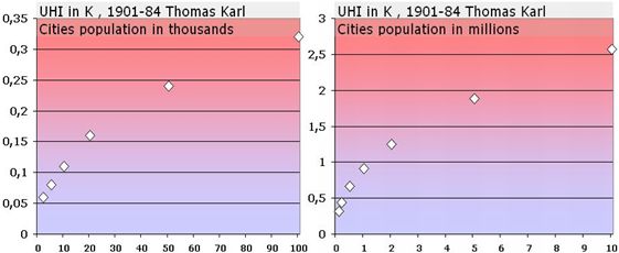
Fig4
Thomas Karls data suggests that increase in population number for cities already large has much less UHI effect generally than a similar increase in population number for a small town. That is, UHI should be expected NOT necessarily in the biggest urban areas of the world, BUT in the areas with biggest relative population growth.
So where are the areas with the biggest relative population growth?
They are here:
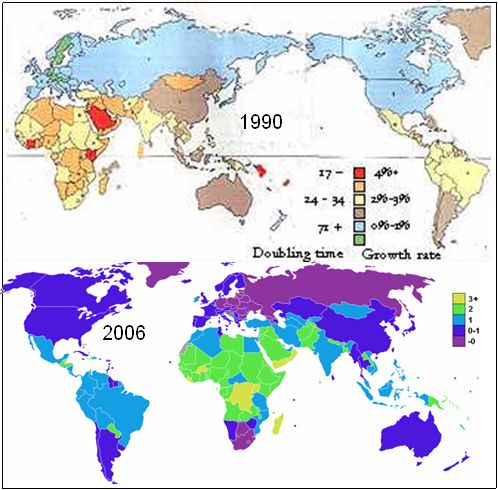
Fig5
Population growth rate: I found 2 such statistics from the 1979-2009 period, upper effective in 1990 and the lower in 2006.
Result: North America, Europe and Australia has the lowest growth while Africa incl Sahara, and Brazil and more countries in South America and also large parts of Asia has the biggest population growth rate.
So lets take a look at the UHI expectations from fig 2 from Bob Tisdales data compared to the relative population growth maps. I have pasted the “UHI”- and “No UHI”-expectaions from fig 2, Bob Tisdales data onto the map showing relative population growth:
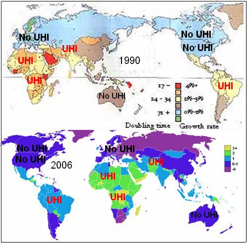
Fig6
– The match with the relative population growth 1990 and 2006 is perhaps better than we could have demanded since many factors hypothetically could have made the picture blurry.
Bob Tisdales data seems to confirm that the divergence in GISS ground based data compared to UAH TLT could possibly be due to UHI, at least partly. At least if we expect UHI mostly from areas not just with a large Urban fraction but rather UHI mostly from areas with the fastes relative growth. And this sounds to me reasonable.
Update 25/1 – Russia/Asia:
The national population growth rate of Russia is near zero in the period, but Bob Tisdale found extra heat in GISS data compared to UAH over Siberia. This further supports the population related UHI problem because population over Siberia did in fact rise in the period, here a russian statistic from 1995:
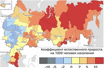
But since most Russians live in the Euopean part where population has been declining, the national population numbers are not useful to justify the warmer GISS data compared to UAH over Siberia. So, population numbers suggests UHI over Siberia, but not the European part of Russia.
Then, my “UHI” over southern asia: The Tisdale Asia covers Siberia and southern Asia, but the extra heat in GISS compared to UAH is larger for this Asia area than just the Siverian area. Therefore, the Southern Asiea has the largest divergence GISS vs. UAH.
–> I will within a short time present a new article without any reference to Bob Tisdales results, but in stead a much more detailed analysis where also regional population data from all the wolrds largest countries will be used in addition to national population data.
Conclusion
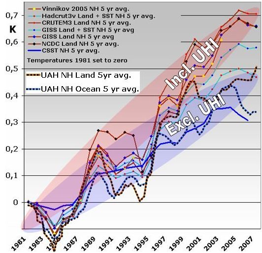
Fig 7
UAH ocean temperatures , UAH land temperatures and the most often used SST´s has similar warming trend. The ground based land temperature trends have warmer trends.
This may indicate that the warmer ground based land temperatures has a faulty added warm trend from UHI, adjustments and siting problems.
Further more, the long term resemblance between UAH-land and UAH-ocean appears logical and correct since temperatures over land and sea respectively should have a tendency to seek equilibrium at least on longer term. This further points to Ground the based land data type as the source of errors.
Finally, this writing: It appears, that the UHI fraction in GISS ground based data is likely if we expect that UHI should be most significant in areas with high relative population growth. The rather good match between relative population growth and divergence between GISS and UAH TLT does in fact also a support to the general idea, that UHI plays an important role for the ground based temperatures often measure from cities and airports.
Finally we must add, that many other factors than UHI can play a role – see for example “post scriptum B”.
However, notice in fig 1 how the divergence between GISS groundbased data and UAH data just vanishes all together when we focus on an area with no UHI as McIntyres Peterson data suggests. This could indicate that UHI plays a role not that tiny for the descrepancy between UAH land data and Ground based land data.
* Post Scriptum A *
Where NOT to measure UHI…
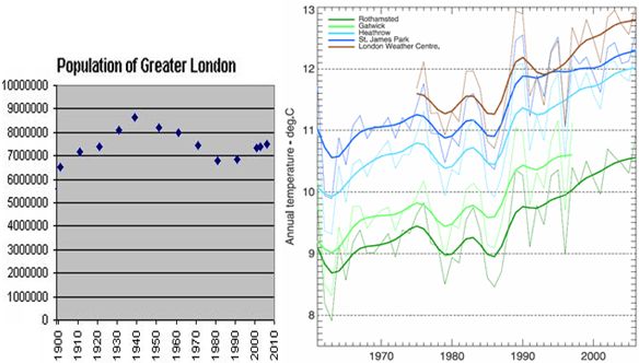
Fig8
Finally a little example I have to mention concerning UHI:
When speaking of “where not to measure UHI”, the absolute best spot in the world is London.
Central Southern England is one of the areas of the world with highest population density which makes the area one big urban warmed area. In Southern central England, no matter from where the wind comes from it will come from a highly populated area, and thus there are no truly rural areas to test UHI with. On top of this, ever since 1900, London has been a multi million population city, which is extraordinary. So, any attempt to measure UHI using London of all towns compared to a non rural surrounding area is a remarkable quest indeed.
Non the less, London of all places is one of the corner stones when skepticalscience argues that there is no UHI worth mentioning:
http://www.skepticalscience.com/urban-heat-island-effect-intermediate.htm
* Post Scriptum B *
In Fig 2 above, I have inserted a “UHI”” mark in the north Atlantic.
This is not the Faroe Island or the like, no its due to a GISS (LOTI) ground based data for north Atlantic with warmer trend than AUH TLT, Bob Tisdale:
http://bobtisdale.blogspot.com/2010/10/on-differences-between-surface-and-tlt.html
Obviously this is an example where UHI does not play a part in the difference between GISS and UAH. For the oceans, the GISS (LOTI) are hadcrut SST data sampled 2 meter under surface. In contrast, UAH mostly relects low Marine Air temperature, and these to different temperature sets are likely to induce some differences.
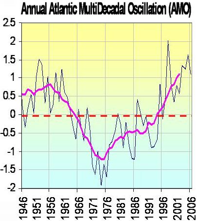
Fig9
In the period in question, the AMO current has sent stil warmer waters to the North Atlantic. My guess is that an event like a strong AMO rise in the North Atlantic might play a role. The AMO is know for warming up the air of the North Atlantic land and sea areas, and if the heat comes from the waters, the AMO current, then perhaps its not impossible that water temperature in the period is slightly warmer than the air? This is what it take if the warm AMO current is warming up the Northern atlantic land areas etc. Just a guess, obviously.
* Post Scriptum C *
I have taken the liberty to write “No UHI” on the maps for Australia. In fact Bob Tisdale got GISS to have lower warming trend than UAH TLT on his “Australia”.
In my maps for relative population growth, I only have full countries, but Bob Tisdale chose a fraction of central Australia, not the whole Australia. but if we use all of Australia the GISS trend is much warmer.
Heres a compare of the GISS (LOTI) temperature trend for Australia 1979-2009 [little picture] compared to recent development in population [big picture] – and we see that the actually slightly falling GISS trend for central Autralia happens to be accompanied by declining population in central Australia:
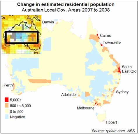
However im sure that world wide one could find many areas where the match between population and heat trends will be poorer than this due to a row of other factors.