Latest facts
Latest...
Login
Kevin Trenberth to Michael Mann, Oct 12, 2009:
The fact is that we can’t account for the lack of warming at the moment and it is a travesty that we can’t. The CERES data published in the August BAMS 09 supplement on 2008 shows there should be even more warming: but the data are surely wrong. Our observing system is inadequate.
Kevin Trenberth to Tom Wigley, Oct 14, 2009
Hi Tom
How come you do not agree with a statement that says we are no where close to knowing where
energy is going or whether clouds are changing to make the planet brighter. We are not
close to balancing the energy budget. The fact that we can not account for what is
happening in the climate system makes any consideration of geoengineering quite hopeless as
we will never be able to tell if it is successful or not! It is a travesty!
Kevin
Leo Tolstoy
“I know that most men, including those at ease with problems of the greatest complexity, can seldom accept even the simplest and most obvious truth if it be such as would oblige them to admit the falsity of conclusions which they have delighted in explaining to colleagues, which they have proudly taught to others, and which they have woven, thread by thread, into the fabric of their lives.”
Phil Jones
“We have 25 or so years invested in the work. Why should I make the data available to you, when your aim is to try and find something wrong with it.” -
Phil Jones to Michael Mann Feb 21, 2005:
The IPCC comes in for a lot of stick.
Leave it to you to delete as appropriate !
Cheers
Phil
PS I'm getting hassled by a couple of people to release the CRU station temperature data.
Don't any of you three tell anybody that the UK has a Freedom of Information Act !
Tom Wigley to Phil Jones Sep 27, 2009:
If you look at the attached plot you will see that the
land also shows the 1940s blip (as I'm sure you know).
So, if we could reduce the ocean blip by, say, 0.15 degC,
then this would be significant for the global mean — but
we'd still have to explain the land blip.
I've chosen 0.15 here deliberately. This still leaves an
ocean blip, and i think one needs to have some form of
ocean blip to explain the land blip (via either some common
forcing, or ocean forcing land, or vice versa, or all of
these). When you look at other blips, the land blips are
1.5 to 2 times (roughly) the ocean blips — higher sensitivity
plus thermal inertia effects. My 0.15 adjustment leaves things
consistent with this, so you can see where I am coming from.
Removing ENSO does not affect this.
It would be good to remove at least part of the 1940s blip,
but we are still left with "why the blip".
Let me go further. If you look at NH vs SH and the aerosol
effect (qualitatively or with MAGICC) then with a reduced
ocean blip we get continuous warming in the SH, and a cooling
in the NH — just as one would expect with mainly NH aerosols.
The other interesting thing is (as Foukal et al. note — from
MAGICC) that the 1910-40 warming cannot be solar. The Sun can
get at most 10% of this with Wang et al solar, less with Foukal
solar. So this may well be NADW, as Sarah and I noted in 1987
(and also Schlesinger later). A reduced SST blip in the 1940s
makes the 1910-40 warming larger than the SH (which it
currently is not) — but not really enough.
So ... why was the SH so cold around 1910? Another SST problem?
(SH/NH data also attached.)
This stuff is in a report I am writing for EPRI, so I'd
appreciate any comments you (and Ben) might have.
Tom.
Tim Osborn to Michael Mann and Ian Macadam , Oct 5, 1999:
Dear Mike and Ian
Keith has asked me to send you a timeseries for the IPCC multi-proxy
reconstruction figure, to replace the one you currently have. The data are
attached to this e-mail. They go from 1402 to 1995, although we usually
stop the series in 1960 because of the recent non-temperature signal that
is superimposed on the tree-ring data that we use. I haven't put a 40-yr
smoothing through them - I thought it best if you were to do this to ensure
the same filter was used for all curves.
Keith Briffa:
Briffa:
For the record, I do believe that the proxy data do show unusually
>warm conditions in recent decades. I am not sure that this unusual warming
>is so clear in the summer responsive data. I believe that the recent warmth
>was probably matched about 1000 years ago. I do not believe that global
>mean annual temperatures have simply cooled progressively over thousands of
>years as Mike appears to and I contend that that there is strong evidence
>for major changes in climate over the Holocene (not Milankovich) that
>require explanation and that could represent part of the current or future
>background variability of our climate. I think the Venice meeting will be
>a good place to air these isssues.
RUTI
RUTI
”Rural Unadjusted Temperature Index”
RUTI is not all rural nor all unadjusted. However, RUTI is a temperature index aiming to use still more rural data (less use of city and airport data), still more unadjusted data when available and reasonable.
The highest priority of RUTI is to
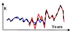
1) compare temperatures for the recent warmer years 1995-2010 with the previous warm peak around 1925-45 and
2) evaluate to what degree rural data is actually used by GHCN, Hadcrut and others and
3) evaluate the corrections done by GHCN, Hadrut or other data sources .
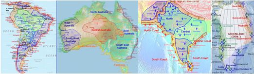
To make RUTI results as useful as possible quite some effort is done to dig up real temperature trends, here for NW Europe. Another characteristic of RUTI is the method of averaging mostly within areas of same trend:
RUTI: Temperature averages are taken from areas of similar temperature trend

One of the most important advantages for RUTI temperature results compared to other temperature series is, that RUTI temperature trends are normally based on temperature averages taken from geographical areas with similar temperature trends.
And why is this essential?
One of the dangers of averaging different kinds of temperature data is, that the temperature datasets often do not cover same years. Below are examples of how simple temperature averages can go wrong.

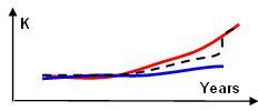
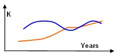
EX1a A temperature average taken across two stations with different trends and different years of available data can easily create a significantly incorrect average, see black dotted line.

EX1b – here a typical example of averaging shorter rural series with longer suburban, urban or coastal temperature series. LINKXXXX

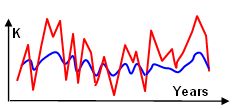
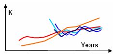
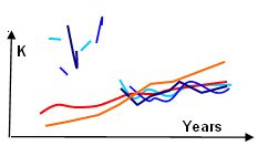
EX2a Averaging stations with different temperature variability: The blue temperature series is located where temperatures are rather stable generally, the red shows a near by temperature series with large temperature variation (Ex. Surrounded by icy mountains). Not much temperature trend in either graph.

EX2b But, if the years of data made public available are not the same for the 2 temperature series, an average can very easily create a strong faulty temperature trend. Even without any adjustments done.

EX3 Averaging stations that does not represent similar size of areas: For example, averaging coastal data representing just a thin coast line area with a non-coastal station representing a larger bulk of land will give an incorrect result. - Or averaging an icy mountain peak data representing a small area with a low land station representing a larger bulk of land could give a wrong result. Etc.

EX4 Averaging (typically rural) “graffiti data” with more complete data series (for example Coastal or Urban) will give an incorrect result.
EX4: Here rural "grafitti data" from China.
And so on. After having worked my way through 4-5000 temperature graps, I considder the above situations for "classic" errors. (I can easily imagine, that averaging errors like the above accounts for more heat trend than adjustments themselves.) All such problems of wrong averaging is better avoided by FIRST locate what areas generally has what trends, and THEN you can do averaging. And of course remove really obvious UHI stations before averaging.
This has been done for the RUTI results, and thus, RUTI data has advantages compared to other sources of temperature data.
UHI:
From Turkey, GHCN unadjusted: Only non-rural temperature data is available outside a narrow period 1960-90. - And only the few very largest cities have temperature series from around 1920 until today. We are simply forced to use the most urban data for Turley even though Turkey has around 250 temperature stations, of which over 100 are rural.
For areas with a systematic removal of rural data – like Turkey – or South Africa , such an area will remain as a “grey zone” of no data for overall global trends in RUTI.
Some argues, that urban heat is of small importance in temperature data, but few argues that rural data should in fact be faulty. Thus, I believe that most will agree that using mostly rural based temperature index should not itself be inducing significant errors.
Not rarely, larger towns (EX: San Sebastian in Spain, Ruzine well outside Prag) have temperature stations located in a rural environment and should be treated as rural. Thus, the main criteria to evaluate if a temperature station is rural or not is to check out the position using google maps. It is the relative growth of a city that determines the UHI pollution for a temperature stations, not the absolute size of a city. Therefore for RUTI use, stations that are located outside urban area or at least do not show a temperature trend significantly different than the near by rural stations are preferred.
In many areas, rural data are scarce and to some degree we have to use some (sub-) Urban data.
They choice of labeling a station as rural vs. urban will always give room for discussion, but RUTI has the advantage that desicions are normally clear for all to see.
Hadcrut on the other hand use only 10 rural stations for the US, the average Hadcrut US station has 1,3 mio inhabitants. No doubt UHI will always be a "grey zone" but obviously the RUTI approach to openly dismiss certain stations must be better than the hadcrut approach.
Temperature trend for an area is mostly the result of decisions what data to use and to what extend.
The resulting temperature trend of a specific area is typically quite dependent on several qualitative decisions. It thus makes no sense to do mathematical processing or other fine adjustments before you know you have the basic temperature data that actually is the best available.
Data origin.
To begin with, data is retrieved via the Appinsys.com climate data utility. I use GHCN unadjusted data that originates from NOAA. In addition I use other data sources (like Nordklim ) but such data sources will be mentioned when used. The base year period is 1960-69 unless otherwise noted. This short period was chosen because data often is limited or missing and a 30-year base period would lack data. In some cases, local areas was better represented by using best fit.
Base period for area-trends:
General Base period for overall trends: 1961-90. All overall trends used for compares with other areas or averaging with other areas has this base period. This is done to enable later compares with GISS trends etc.
To understand the procedures of RUTI I recommend starting with the South African and Mozambique case where procedures are explained.
Hereafter:
Some geographical areas are not yet included online for RUTI, but most will be. When most of the Earth´s land area is covered, global and regional trends will be estimated using 1961-90 as base line years.
!! Articles, graphs and all on RUTI will be changed often to constantly seek the best "product" for the readers. I do not claim that RUTI temperature series are perfect, since you can allways change something. But this is an open process and opinions are welcome !!
Much time has been saved by using Alan Cheethams amazing climate data utility: Appinsys.com - A warm THANKYOU to Appinsys and co!
CONTENTS (to be updated):
Highlights
Africa
Asia
Australia
Europe
North America
Russia
South America
Coastal temperature stations
Global RUTI trends (not yet used)
Fast navigation, use:

Final comment:
When examining temperature data, very fast you become aware of the strong dependence of local geography on temperature trends. (see for example RUTI Coastal temperature stations)
This should be considered to be a banal basic fact for all.
Therefore, the only correct approach to explore temperature data is to map these areas of similar temperature trends, and then weight the local trends according to the sizes of each area - as normally done for RUTI results.
Perhaps some will call my work for “banal amateur work” etc., but I hope some of you will realise, that these banalities should have been part of the basic methods for evaluating land temperatures done by GISS, CRU and others. Institutions like GISS and CRU have had every possibility to know and implement the above basic methods.
But why do they use 1200 km zones (GISS) or just a scarce set of stations that do not represent the significant local differences in temperature trends (CRU) ?
What is the scientific argument not to do temperature trend estimates absolutely best possible?
Kevin Trenberth to Michael Mann, Oct 12, 2009:
The fact is that we can’t account for the lack of warming at the moment and it is a travesty that we can’t. The CERES data published in the August BAMS 09 supplement on 2008 shows there should be even more warming: but the data are surely wrong. Our observing system is inadequate.
Kevin Trenberth to Tom Wigley, Oct 14, 2009
Hi Tom
How come you do not agree with a statement that says we are no where close to knowing where
energy is going or whether clouds are changing to make the planet brighter. We are not
close to balancing the energy budget. The fact that we can not account for what is
happening in the climate system makes any consideration of geoengineering quite hopeless as
we will never be able to tell if it is successful or not! It is a travesty!
Kevin
Leo Tolstoy
“I know that most men, including those at ease with problems of the greatest complexity, can seldom accept even the simplest and most obvious truth if it be such as would oblige them to admit the falsity of conclusions which they have delighted in explaining to colleagues, which they have proudly taught to others, and which they have woven, thread by thread, into the fabric of their lives.”
Phil Jones
“We have 25 or so years invested in the work. Why should I make the data available to you, when your aim is to try and find something wrong with it.” -
Phil Jones to Michael Mann Feb 21, 2005:
The IPCC comes in for a lot of stick.
Leave it to you to delete as appropriate !
Cheers
Phil
PS I'm getting hassled by a couple of people to release the CRU station temperature data.
Don't any of you three tell anybody that the UK has a Freedom of Information Act !
Tom Wigley to Phil Jones Sep 27, 2009:
If you look at the attached plot you will see that the
land also shows the 1940s blip (as I'm sure you know).
So, if we could reduce the ocean blip by, say, 0.15 degC,
then this would be significant for the global mean — but
we'd still have to explain the land blip.
I've chosen 0.15 here deliberately. This still leaves an
ocean blip, and i think one needs to have some form of
ocean blip to explain the land blip (via either some common
forcing, or ocean forcing land, or vice versa, or all of
these). When you look at other blips, the land blips are
1.5 to 2 times (roughly) the ocean blips — higher sensitivity
plus thermal inertia effects. My 0.15 adjustment leaves things
consistent with this, so you can see where I am coming from.
Removing ENSO does not affect this.
It would be good to remove at least part of the 1940s blip,
but we are still left with "why the blip".
Let me go further. If you look at NH vs SH and the aerosol
effect (qualitatively or with MAGICC) then with a reduced
ocean blip we get continuous warming in the SH, and a cooling
in the NH — just as one would expect with mainly NH aerosols.
The other interesting thing is (as Foukal et al. note — from
MAGICC) that the 1910-40 warming cannot be solar. The Sun can
get at most 10% of this with Wang et al solar, less with Foukal
solar. So this may well be NADW, as Sarah and I noted in 1987
(and also Schlesinger later). A reduced SST blip in the 1940s
makes the 1910-40 warming larger than the SH (which it
currently is not) — but not really enough.
So ... why was the SH so cold around 1910? Another SST problem?
(SH/NH data also attached.)
This stuff is in a report I am writing for EPRI, so I'd
appreciate any comments you (and Ben) might have.
Tom.
Tim Osborn to Michael Mann and Ian Macadam , Oct 5, 1999:
Dear Mike and Ian
Keith has asked me to send you a timeseries for the IPCC multi-proxy
reconstruction figure, to replace the one you currently have. The data are
attached to this e-mail. They go from 1402 to 1995, although we usually
stop the series in 1960 because of the recent non-temperature signal that
is superimposed on the tree-ring data that we use. I haven't put a 40-yr
smoothing through them - I thought it best if you were to do this to ensure
the same filter was used for all curves.
Keith Briffa:
Briffa:
> For the record, I do believe that the proxy data do show unusually
>warm conditions in recent decades. I am not sure that this unusual warming
>is so clear in the summer responsive data. I believe that the recent warmth
>was probably matched about 1000 years ago. I do not believe that global
>mean annual temperatures have simply cooled progressively over thousands of
>years as Mike appears to and I contend that that there is strong evidence
>for major changes in climate over the Holocene (not Milankovich) that
>require explanation and that could represent part of the current or future
>background variability of our climate. I think the Venice meeting will be
>a good place to air these isssues.