Next to the historic data war on the Medieval Warm Period, the data war on the 1940-78 perhaps stands as the most bitter and intense climate disagreement.
This is a follow up to the article: Temperature corrections of the northern hemisphere.
(Thanks to Bo Vinther – “neutral” in the climate debate – who was a great help digging up relevant data)
Changes of temperature data seems to occurs in several areas: Temperature station data, balloon temperature data, SST data, tree ring data, program fudging, cheery picking of data by scientiests, cherry picking of scientists by IPCC etc.etc.
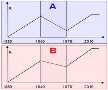
Fig 1.
What happened to the great temperature decline 1940-78?
How did version A of 1940-78 temperatures change into version B ?
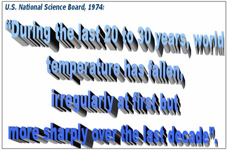
Fig 2.
This little quote is interesting because when IPCC defends cutting tree graphs from 1960 mostly, then the argument is :
“Fall in tree ring data matches real temperatures 1940-60, but after 1960 the fall in “real” temperatures cannot match tree ring data”.
But, in the quote in fig 2, 1964-74 is described as the sharpest temperature drop.
In general, the biggest differences between old pre-1980 temperature sets and new post-1980 temperature sets are located in the years 1958-78. For some reason, just when satellite data starts in 1979, the differences get smaller. No one really corrects temperature data far from satellite data, it seems… – and then we have the argument: “Land temperatures matches Satellite data”.
The present article is a follow up on an article where we presented the difference between temperature data from mid 1970´ies, Newsweek/NCAR/NOAA/NAS/National Geographic and then recent CRU temperature data, Northern Hemisphere:
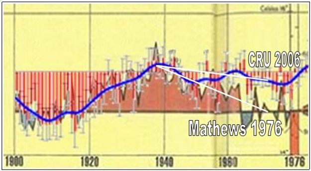
Fig3.
To make some points below I need to mention the Raobcore temperature measurements. These are balloon based temperature measurements that begins in 1958. The Raobcore measurements thus covers around half of the decline period 1940-78. How about the quality of Raobcore surface temperature measurements? – The stunning match between Raobcore and satellite measurement is a tremendous proof of quality balloon data as well as satellite data:
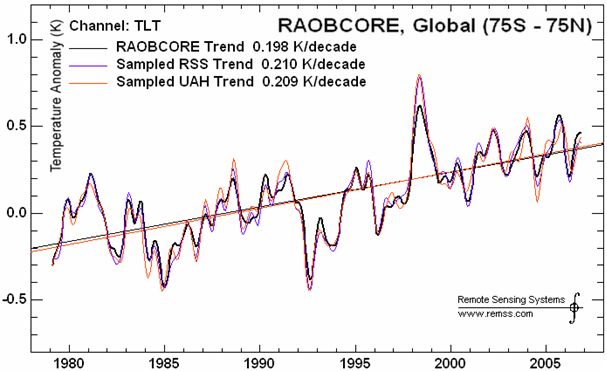
Fig 4.
So it is truly defendable to regard the Raobcore measurements as a high quality product telling us about temperatures all the way back to 1958. The best illustration of Raobcore data before 1979 made easy available on the net is the Tropics 30S-30N – Steve McIntyre presented these data here: http://climateaudit.org/2008/05/03/raobcore-adjustments/
(All temperature data sources shows more cooling in the NH than the SH for 1940-78, and therefore using tropic in stead of NH Raobcore temperature data is not increasing the cooling in data 1940-78).
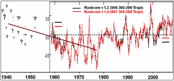
Fig 5.
As usual in the climate ”science” we see that the most recent versions of adjusted data happens to show more warming trend. But still, Raobcore is dynamite. We know that all sources of temperature data confirms steady temperature decline 1940-58, but Raobcore confirms the ongoing significant fall of temperatures 1958-1978. We cannot see the whole decline 1940-1978 from Raobcore data, but for 1958-60 we see same level of temperature as in the 1990´ies.
– And just after 1958, the North pole in 1959-62 looked like this:
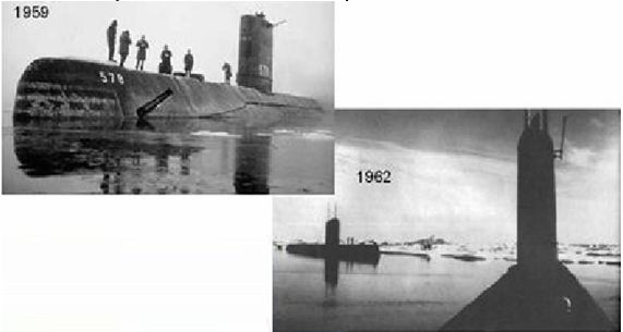
Fig 6.
Now lets go back to the National Geographic, “Mathews 1976” temperature set.
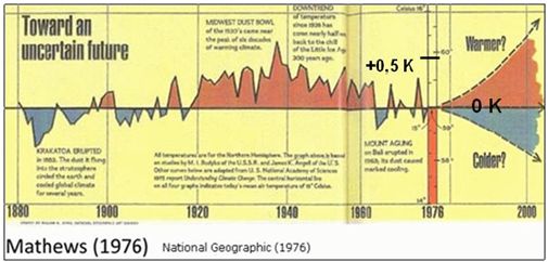
Fig 7.
http://www.nap.edu/openbook.php?record_id=12024&page=55
The Mathews 1976 / national geographic temperature graph are Recorded changes of annual mean temperature of the northern hemisphere as given by Budyko (1969) (temperature data 1880-1960)
– and as updated after 1958 by H. Asakura of the Japan Meteorological Agency using 1958-75 temperature data by Angell and Korshover.
It appears that temperature data used by National geographic 1976 is based on peer reviwed data.
First lets take a look at the years 1958-75, Angel and Korshover. In fact the writing above lists temperature data sets from 4 different scientific writings. Notice the almost identical slope for all 4 Fig 8, and then the nice match with Raobcore Fig 9:
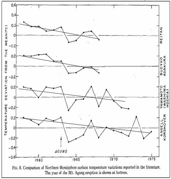
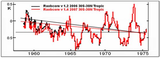
Fig 8 + Fig 9.
In all cases incl. Raobcore we see trends that confirm temperature decline 1958-75 around 0,3-0,4 K, roughly estimated.
The Korshover data is taken from 63 radiosonde stations around the globe:
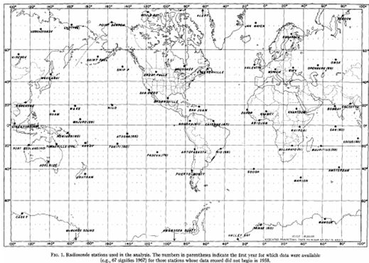
Fig 10.
I dare say this work is indeed showing results from a larger absolutely serious and professional project. Impressive.
Budyko data up to 1960 is gathered monthly temperature anomalies carries out by the Main Geophysical Observatory.
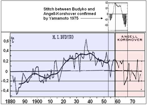
Stitching Budyko and Korshover: It so happens, that the two datasets has a minor overlap period around 1958-60. Fortunately in both temperature sets around the overlap years 1958-59 appears are rather constant, and therefore the stitch appears pretty straight forward, not truly risky.
It seems that Korshover uses the same zero anomaly as Budyko, since the 2 data sets “melts” together when stitching for same zero anomaly (but I cant see what baseline years the zero anomaly is defined for).
The correctness of the stitch is further supported: We can have rather high confidence in the temperature trend of 0,3K 1958-75 as shown above from 5 data series. Therefore the resulting graf must have 1958-59 around 0,3K higher than 1975. The 1958 (and 1959) points of Koshover data is right on the trendline and therefore appears solid to use. Any significant error from the stitch should most likely come from using a wrong point at the Budyko graph.
The stitching is further supported, see fig 14. Hansen (1980) has approximately the same trend of data 1957-65 as National Geographic. Hansens trend changes significantly from NG mostly after 1965.
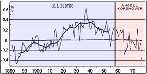
Fig 11.
Addition: There are 3 points where you could stitch Budyko and Korshover, 1958-59-60.
The1958 and 1959 korshover points are spot on the trend graph and thus represents the overall Korshover (and Raobcore etc.) far best. The 1960 point of Korsover is far longer from the trendline and thus represents korshover poorly. The Stitch wa carried out by the Japaneese Meteorological institute, and their apparent chocie o 1958 seems logic and correct.
UPDATE, Stitch confirmed by Yamamoto 1975 NH surface temperature:
http://repository.kulib.kyoto-u.ac.jp/dspace/bitstream/2433/70179/1/a21b1p33.pdf
No doubt, the stitch is where National Geographic 1976 data might be attacked by the critics, but as I´ve explained it looks like a rather reasonable stitch.
From Mitchel 1961 we find another temperature dataset that (with some minor deviations)appear to confirm the Budyko results:
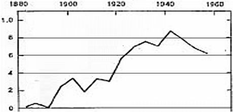
Fig 12. (Global data, not NH – but SH has smaller temperature decline than NH 1940-78, so this does not explain this decline.)
Mitchel has temperature decline 1940-58 around 0,26 K.
So all in all with other data sources (Newsweek/NCAR/NOAA etc.) mentioned, ”Mathews 1976” appears to be a rather valid piece of science based mostly on peer reviewed work, in agreement with Raobcore data which eventually confirms the temperature decline roughly 0,4 K from 1940-78.
So why cut the tree graphs and thus hide the FULL 1940-78 decline?
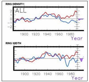
Fig 13.
Finally. Lets checkout what Hansen did to his data set, GISS.
It appears that Hansen in the early 1980´ies did not use the above data, except for the Mitchel graph that ends in 1960.
Hansen had high quality Raobcore measurements for his disposal, The 4 series incl Korshovers 63 radiosonde stations, all data that yielded a common trend of approximately – 0,3 K 1958-75, but heres Hansens new data:
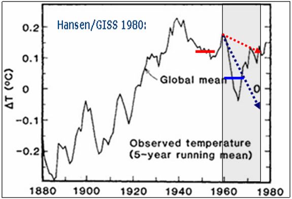
Fig 14.
http://www.giss.nasa.gov/research/features/200711_temptracker/
For the years 1958-75 Hansen/GISS (1980) only finds a temperature decline of approximately 0,07 K (red) in stead of the 0,3 K decline (blue) from Raobcore, Korshover etc.
Hansen/GISS 1980:
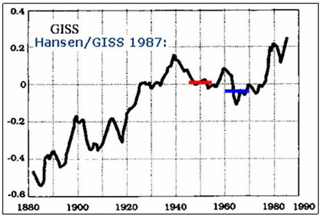
Fig 15.
Hansen/GISS 2007:
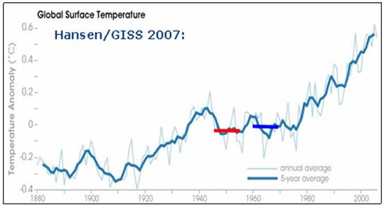
Fig 16.
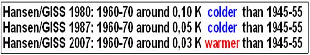
Fig 17. (NG 1976 is of course NH data whereas Hansen/GISS is global)
And we remember:
UPDATE:
Here Steve McIntyres comparison of mostly GISS graphs. I added the 1980 GISS from fig 15:
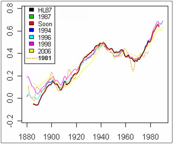
See more: http://climateaudit.org/2007/05/03/risk-management-solutions-ltd-and-the-38-professors/