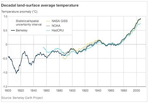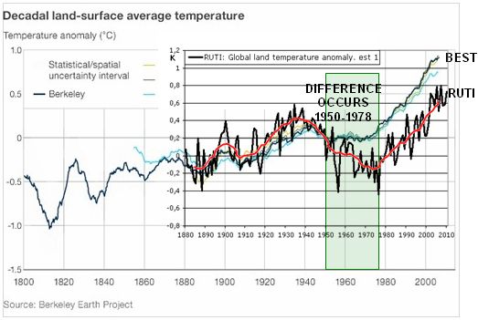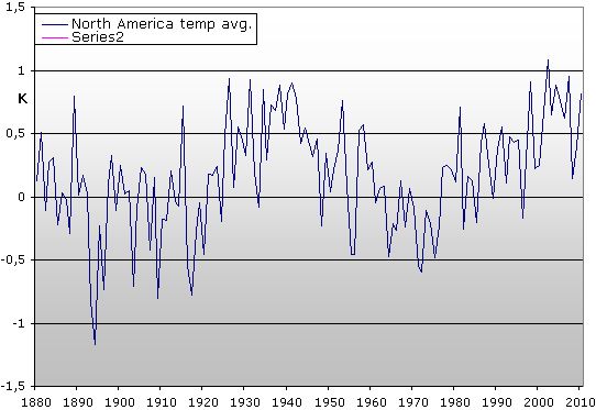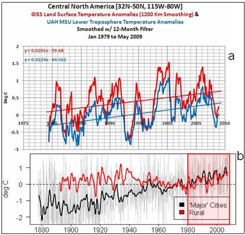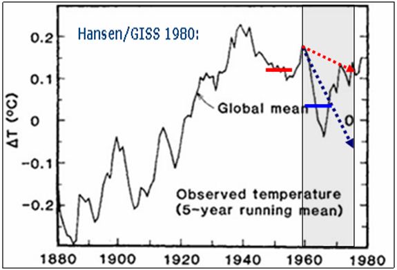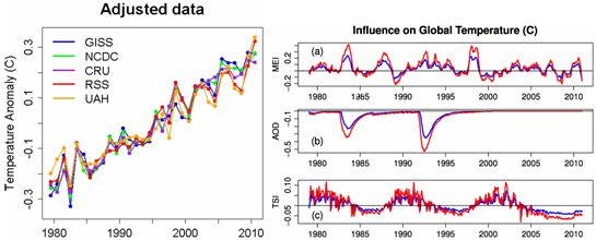
Fig1. Foster and Rahmstorf recently released a writing (sponsored by Casino 41) on ”The real global warming signal”.
http://tamino.wordpress.com/2011/12/06/the-real-global-warming-signal/ The point from F&R is, I believe, debating to counter the “sceptic” argument that temperatures has stagnated during the last decade or more. Since this is an essential issue in the climate debate I decided to investigate if F&R did a sensible calculation using relevant parameters.
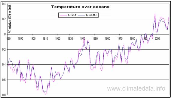
Hadcrut global temperatures do have a rather flat trend these days:
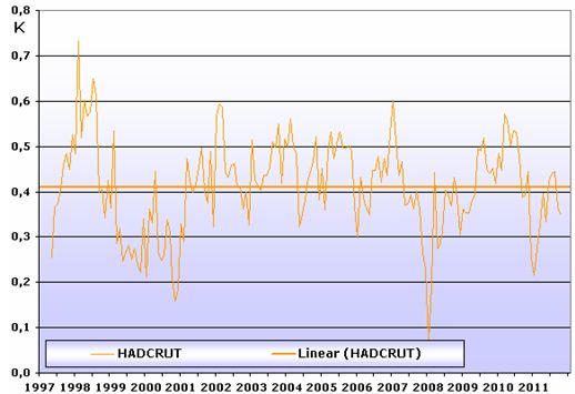
Fig2. It is possible to go back to 1 may 1997 and still see flat trend for Hadcrut temperature data, so this data set will be subject for this writing:
Can F&R´s arguments and calculations actually induce a significant warm trend even to Hadcrut 1998-2011?
F&R use three parameters for their corrections, ENSO, AOD (volcanic atmospheric dimming) and TSI (Total Solar Irradiation).
“Objection”: TSI is hardly the essential parameter when it comes to Solar influence in Earth climate.
More appropriate it would be to use the level “Solar Activity”, “Sunspot number”, “Cloud cover” “Magnetism” or “Cosmic rays”. TSI is less relevant and should not be used as label.

Fig3. FF&R has chosen MEI to represent EL Nino and La Nina impacts on global temperatures. MEI is the “raw” Nina3,4 SST that directly represents the EL Nino and La Nina, but in the MEI index, also SOI is implemented. To chose the most suited parameter I have compared NOAA´s ONI which is only Nina3.4 index and MEI to temperature graphs to evaluate which to prefer.
Both Hadcrut and RSS has a slightly better match with the pure Nina 3,4 ONI index which will therefore be used in the following. (Both sets was moved 3mth to achieve best it with temperature variations).
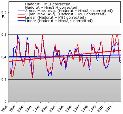
Fig4.
After correcting for Nina3,4 index (El Nino + La Nina) there is still hardly any trend in Hadcrut data 1998-2011. (If MEI is chosen, this results in a slight warming trend of approx 0,07 K/decade for the corrected Hadcrut data 1998-2011).
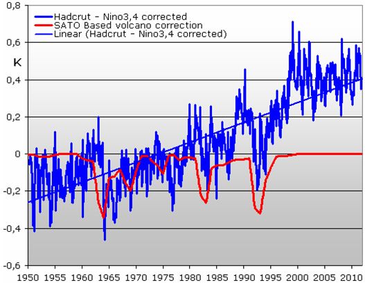
Fig5. I then scaled to best fit for SATO volcano data set. For the years after 1998, there is not really any impact from volcanoes, and thus we can say:
There is no heat trend in Hadcrut data after 1998 even when corrected for EL Nino/La Nina and volcanoes.
However, this changes when inducing Solar activity, I chose Sun Spot Number, SSN, to represent the Solar activity:
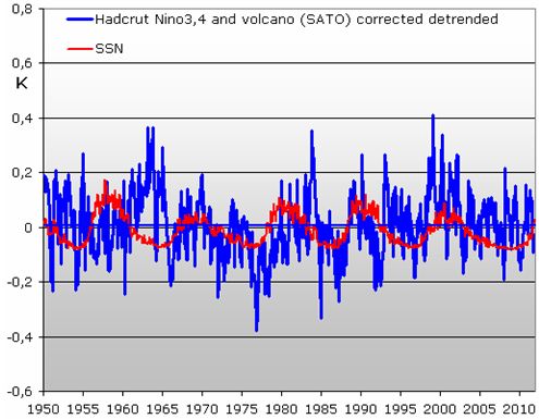
Fig6.
To best estimate the scaling of SSN I detrended the Nino3,4 and volcano corrected Hadcrut data and scaled SSN to best fit. Unlike F&R, I get the variation of SSN to equal 0,2K, not 0,1 K as F&R shows.
Now see what happens:
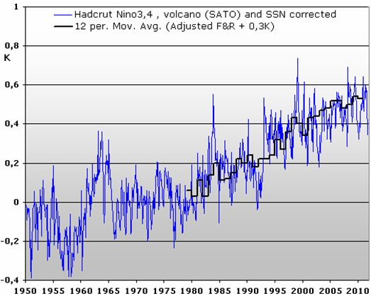
Fig7.
F&R describes the Solar activity (“TSI” as they write…) to be of smallest importance in their calculations. However, it is only the Solar activity, SSN, that ends up making even the Hadcrut years after 1998 show a warm trend when corrected. On Fig7 I have plotted the yearly results by F&R for Hadcrut and they are nearly identical to my results.
So, a smaller warming from my using Nino 3,4 combined with the larger impact of Solar activity I find cancels out each other.
ISSUES
For now it has been evaluated what F&R has done, now lets consider issues:
1) F&R assume that temperature change from for exaple El Nino or period of raised Solar activity etc. will dissapear fully immidiately after such an event ends. F&R assumes that heat does not accumulate from one temperature event to the next.
2) Missing corrections for PDO
3) Missing corrections for human aerosols – (supposed to be important)
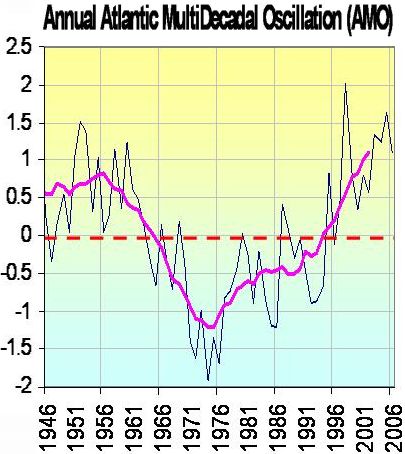
4) Missing corrections for AMO
5) F&R could have mentioned the effect of their adjustments before 1979
Issue 1: F&R assume that all effect from a shorter warming or cooling period is totally gone after the effect is gone.
Fundamentally, the F&R approach demands that all effects of the three parameters they use for corrections only have here-and-now effects.
Example:
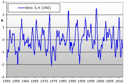
Fig8.
In the above approaches, the Nino3,4 peaks are removed by assuming that all effects from for example a short intense heat effect can be removed by removing heat only when the heating effect occurs, but not removing any heat after the effect it self has ended.
Now, to examine this approach I compare 2 datasets. A) Hadcrut temperatures, “corrected” for Nina3,4 , volcanoes and SSN effects as shown in the above – detrended. B) The Nino3,4 index indicating El Ninos/La Ninas and thus the timing of adjustments. (We remember, that the Nino3,4 was moved 3 months to fit temperature data before adjusting):
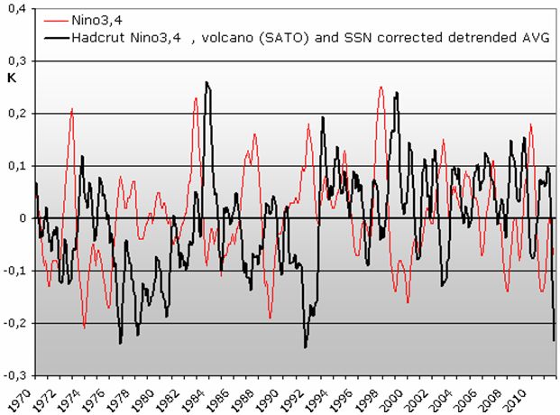
Fig9.
After for example “removing” heat caused by El Ninas during the specific El Nino periods, you see heat peaks 1 – 2 years later in the “Nino3,4” corrected detrended temperature data.
That is: After red peaks you see black peaks..
This means that the approach of systematically only removing heat when heat effect is occurring is fundamentally wrong.
Wrong to what extend? Typically, the heat not removed by correcting for Nina3,4 shows 1-2 years later than the heat effect. Could this have impact on decadal temperature trends?
Maybe so: In most cases of El Nino peaks, first we have the Nino3,4 red peak, then 1-2 years after the remaining black peak in temperature data that then dives. But notice that normally the dives in remaining heat (black) normally occurs when dives in the red Nino3,4 index starts.
This suggests, that the remaining heat from an El Nino peak is not fast disappearing by itself, but rather, is removed when colder Nino3,4 conditions induces a cold effect.
In general, we are working with noisy volcano and SSN corrected data, so to any conclusion there will be some situations where the “normal” observations is not seen strongly.
Now! What happens is we focus on periods where the Nino3,4 index for longer periods than 2 years is more neutral – no major peaks?
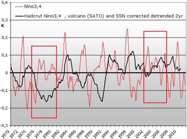
Fig10.
Now, the detrended Hadcrut temperature “corrected” for Nina3,4, Volcanoes and SSN – black graph – has been 2 years averaged:
The impact of El Ninos and La Ninas is still clearly visible in data supposed to be corrected for these impacts. Since this correction by F&R is their “most important” correction, and it fails, then we can conclude that F&R 2011 is fundamentally flawed and useless.
Reality is complex and F&R has mostly seen the tip of the iceberg, no more.
More: Notice the periods 1976-1981 and 2002-2007. In both cases, we a period of a few years with Nino3,4 index rather neutral. In these cases, the temperature level does not change radically.
In the 1976-81 period, the La Ninas up to 1977 leaves temperatures cold, and they stay cold for years while Nino3,4 remains rather neutral. After the 2002-3 El Nino, Nino3,4 index remains rather neutral, and temperatures simply stays warm.
Issue 2: Missing corrections for PDO
Quite related to the above issue of ignoring long term effects of temperature peaks, we see no mention of the PDO.

Fig11. Don Easterbrook suggests that a general warming occurs when PDO is warm, and a general cooling occurs when PDO is cold. (PDO = Pacific Decadal Oscillation). That is, even though PDO index remains constant but warm, the heat should accumulate over the years rather than be only short term dependent strictly related to the PDO index of a given year. This is in full compliance with the long term effects of temperature peaks shown under issue 1.
Don Easterbrook suggests 0,5K of heating 1979-2000 due the PDO long term heat effect.
I think the principle is correct, I cant know if the 0,5K is correct – it is obviously debated – but certainly, you need to consider the PDO long term effect on temperatures in connection with ANY attempt to correct temperature data. F&R fails to do so, although potentially, PDO heat is suggested to explain all heat trend after 1979.
I would like to analyse temperature data for PDO effect if possible.

Fig12. PDO data taken from http://jisao.washington.edu/pdo/PDO.latest
To analyse PDO-effect we have to realise that PDO and Nino3,4 (not surprisingly) have a lot in common. This means, that I cant analyse PDO effects in a dataset “corrected” for Nino3,4 as it would to some degree also be “corrected” for PDO…
More, this strong resemblance between Nino3,4 and PDO has this consequence:
When Don Easterbrook says that PDO has long term effect, he’s also saying that Nino3,4 has long term effects – just as concluded in issue 1.

Fig13. Thus, I am working with PDO signal compared to Hadcrut temperatures corrected for volcanoes and SSN only. The general idea that heat can be accumulated from one period to the next (long term effects) is clearly supported in this compare. If PDO heat (like any heat!) can be expected to be accumulated, then we can se for each larger PDO-heat-peak temperatures on Earth rises to a steady higher level.

Fig14. Note: in the early 1960´ies, the correction of volcano Agung is highly questionably because different sources of data concerning the effect of Agung are not at all in agreement. Most likely I have over-adjusted for cooling effect of Agung. On the above graph from Mauna Loa it appears that hardly any adjustment should be done…
Scientists often claim that we HAVE to induce CO2 in models to explain the heat trend. Here we have heat trends corrected for volcanoes and SSN, now watch how much math it takes to explain temperature rise after 1980 using PDO:
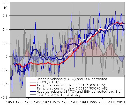
Fig15. “Math” to explain temperature trend using PDO. Due to the uncertainty on data around 1960 (Agung + mismatch with RUTI world index/unadjusted GHCN) I have made a curve beginning before and after 1960. For each month I add a fraction of the PDO signal to the temperature of last month, that is, I assume that heat created last month “wont go away” by itself, but is regulated by impacts of present month. This approach is likely not perfect either but it shows how easy temperature trends can be explained if you accept PDO influence globally.
(In addition I made some other scenarios where temperatures would seek zero to some degree, and also where I used square root on PDO input which may work slightly better, square root to boost smaller changes near zero PDO).
Now, how can PDO all by itself impact a long steady heat on Earth?? Does heat come from deep ocean or??
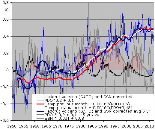
Fig16. It goes without saying that SSN and PDO (and thus Nina3,4 as shown) are related.
Is it likely that PDO affects Sun Spot Numbers? No, so we can conclude that Solar activity drives temperatures PDO which again can explain temperature changes on Earth.
Suddenly this analysis has become more interesting than F&R-evaluation, but this graph also shows that F&R was wrong on yet another point: Notice on the graph that we work the temperatures “CORRECTED” for Solar activity… But AFTER each peak of SSN we see accumulation of heat on earth still there after “correcting” for solar activity. Thus, again, it is fundamentally wrong to assume no long term affects of temperature changes. This time, temperature effect can be seen in many years after the “corrected” Solar activity occurred.
Conclusion: PDO appears Solar driven and can easily explain temperature developments analysed.
Thus perhaps the most important factors to be corrected for – if you want to know about potential Co2 effects – was not corrected for by F&R 2011.
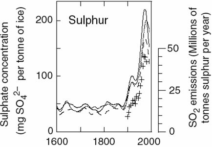
Issue 3: Missing corrections for human aerosols – that are supposed to be important
It is repeatedly claimed by the AGW side in the climate debate that human sulphates / aerosols should explain significant changes in temperatures on earth.
When you read F&R I cant stop wonder: Why don’t they speak about Human aerosols now?
http://www.manicore.com/anglais/documentation_a/greenhouse/greenhouse_gas.html
Fig17. In basically all sources of sulphur emissions it appears that around 1980-90 these started to decline.
If truly these aerosols explains significant cooling, well, then a reduced cooling agent after 1980 should be accounted for when adjusting temperature data to find “the real” temperature signal.
F&R fails to do so.
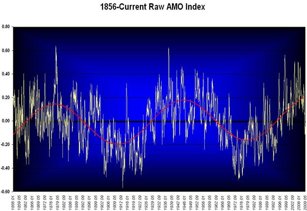
Issue 4: Missing corrections for AMO
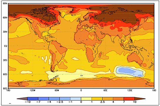
AMO appears to affect temperatures in the Arctic and also on large land areas of the NH.
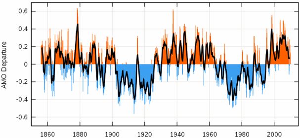
Fig18. In fact, the temperatures of the AMO-affected Arctic is supposed to be an important parameter for global temperature trends, and thus correcting for AMO may be relevant.
The AMO appears to boost temperatures for years 2000-2010 , so any correction of temperatures using AMO would reduce temperature trend after 1980.
F&R do not mention AMO.
Issue 5: F&R could have mentioned the effect of their adjustments before 1979
F&R only shows impacts after 1979, possibly due to the limitations of satellite data.
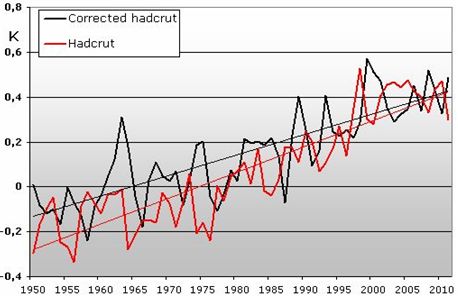
Fig19. “Correcting” Hadcrut data for nino3,4 + volcanoes it turns out that the heat trend from 1950 is reduced around 0,16K or around 25%. Why not show this?
I chose 1950 as staring point because both Nina3,4 and SATO volcano index begins in 1950.
Conclusion
F&R appear seems to assume that temperature impacts on Earth only has impact while occurring, not after. If you heat up a glass of water, the heat wont go away instantly after removing the heat source, so to assume this for this Earth would need some documentation.
Only “correcting” for the instant fraction of a temperature impact and not impacts after ended impact gives a rather complex dataset with significant random appearing errors and thus, the resulting F&R “adjusted data” for temperatures appears useless. At least until the long term effect of temperature changes has been established in a robust manner.
Further, it seems that the PDO, Nin3,4 and Solar activities are related, and just by using the simplest mathematics (done to PDO) these can explain recent development in temperatures on Earth. The argument that “CO2 is needed to explain recent temperature trends” appears to be flat wrong.
Thus “correcting” for PDO/Nina3,4 long term effect might remove heat trend of temperature data all together.
Solar activity is shown to be an important driver PDO/Nino3,4 and thus climate.
Finally, can we then use temperature data without the above adjustment types?
Given the complexities involved with such adjustments, it is definitely better to accept the actual data than a datasets that appears to be fundamentally flawed.
Should one adjust just for Nino3,4 this lacks long time effects of Nina3,4 and more it does not remove flat trend from the recent decade of Hadcrut temperature data.